Although people look for the big show-stopping killer-improvements when a new release of Ubuntu rolls around I find that it can be the small things which make the biggest difference.
During the Lucid development cycle I’ll be highlighting some of these small changes in a series of articles called ‘Little things that matter’.
The Messaging Menu
I have, many times, read people calling the Messaging Menu in Karmic ‘useless’ and unhelpful. To a large extent I could sympathize: it was a new way of interacting with messaging applications and the unfamiliar always puts smoke up the chimneys of the user.
What is the Messaging Menu again?
It’s the little envelope sat on the top panel.
The messaging menu is a simple idea – a single menu holds all of the ‘messaging’ alerts from your messaging applications until you act on them. With some applications you can specify which alerts to be notified about.
I tend to think of it as a holding pen for my limited attention span; far too often prior to the Messaging Menu I’d notice a new IM message then get distracted by something else for a second and end up forget about the original alert.
The messaging menu solves this for me by keeping these alerts ‘warm’ until I act on them.
Life saver.
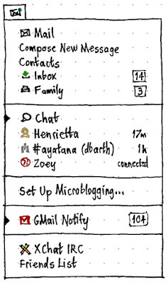
The messaging menu in Ubuntu 10.04
The changes are actually quite clear to see in the Lucid’s updated and jazzed out version of the titular application and whilst the work isn’t yet finished, the updates so far all point to win.
You just have to click on it to see: –

Gone are the application description. After-all – if i use an application chances are i know what it does, right?
In are some application icons – These make the infinitely more navigable: compare with the incumbent style: –

image stolen from http://www.vanutsteen.nl – thanks/sorry!
Only having application names requires me to pay attention whereas icons require a mere glance.
Width
The menu width also auto-resizes to accommodate the menu entries. I often felt that the previous incarnation was an overly large and overly wide block of utter menu-ness. This small change gets two thumbs up and a slice of cherry pie.

Bigger Changes
Of course there are bigger changes to the menu applet than aesthetics. It behaves differently, too.
First login of a fresh install and you’ll be seeing this:

Once accounts are set up and in use you’ll be seeing this:
Note the little triangles on the side of running applications. This is such a tiny (literally in this case) addition yet a massive usability improvement. Previously the only way to tell if a messaging menu application was running was to either wait for a notification or notice that the ‘description’ was hidden.
Indicator triangles are much more identifiable. (And will save me so many unbeknownst logins to Empathy…)
MeMeMeMenu
I’ll round off this little personal love-fest for awesome user-design with a picture of the latest addition to the Lucid MeMenu. We’ve already seen it get Gwibber integration and now but the latest updates have given it a personal touch, knocking it ¾ of the way into the proposed design ballpark.

I love Canonical/Ubuntu.