Every 3 months Canonical conduct ‘benchmark testing’ of Unity, to ensure that the design decisions being made are improving user experience and not hampering.
In a UDS session presenting the results of recent testing, some surprising results emerged – and most of it countering the negative perception many assume Unity has in the eyes of the target mind.
Although a small number of testers are used in the qualitative testing, they are selected very specifically to best demonstrate the target audience of Ubuntu. They are a mix of Windows and Mac users who spend at least 10 hours a week on a computer. They tend to know how to download music, attach peripherals and other fault sedate computing affair.
Perhaps this is one caveat in the data accrued thus far: the focus has been with “Joe Consumer” representatives and not those more advanced or all ready familiar with Linux.
But still.
‘First time usage’
Although this write up of the results will be by no means as exhaustive as that Canonical will present in time, it’s based solely on the information presented at the UDS session, it makes for some interesting and insightful examples of how Unity looks in the eyes of non-Ubuntu users.
Since 2010
Charline Poirier, Canonical’s user testing genius, began the session by highlighting many of the issues users found in the last batch of Unity testing back in 2010.
Back then users had issues changing their wallpaper, viewing documents side by side; managing workspaces; finding an overview of their system; deleting documents.. etc
The results of 2011 see most, if not all, of the above issues solved. In particular testers found the addition of ‘System Settings’ to the Unity launcher to be a massive boon – and to think I scoffed at this change myself.
Overall testers find Unity ‘very usable’, with positive first impressions on the ‘clean and sober’ interface. They love the look at feel, particularly the transparency; the launcher is well received, as are the new handling of workspaces.
And before you think they’re just being polite the overall perception of Ubuntu has changed in just one year. Where before testers didn’t find Ubuntu ‘a bad product’, they did concede that you’d need ‘motivation’ to switch.
And now? Most testers expressed a desire to ‘give it a try’, calling it an ‘interesting OS’.
That’s not a bad turn-around.
Specific features
The Launcher
The Launcher made finding applications easy. All testers were able to launch Firefox when asked. Likewise they were able to launch the System Settings application.
Users were less sure of how to initiate the application spread, and when asked to ‘Pin’ an open application to Launcher most expected it to be auto-pinned as the icon was already there.
A quick poke around after realising the icon goes when the app closes resulted in most finding the ‘Pin to Launcher’ option.
Despite the handy arrows on the left-hand side of launchers indicating running applications some testers never noticed them. Interestingly, the number of users who could tell how many apps were running was higher in 2010.
The Dash
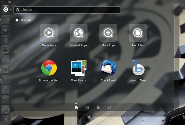
The Dash received a less warm welcome.
The first issue is that, despite the contentious move of the BFB from the top panel to the Launcher, users still seem unaware of how to open the Dash.
But when it is shown to them its relevance is questioned. “What’s the difference between the dash and the launcher?” one tester asked. And they have a point…

The good news is that the main “Dash” display (the one with 8 icons on) is to be retired for Precise, although the search bar will remain.
Most users relied on Nautilus for file browser, rather than using Unity’s dedicated File Lens.
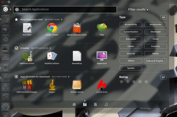
Filters were hard to find, although liked once highlighted to them (although the usefulness of the ‘star rating’ filter was questioned).
‘Apps available for download’
One aspect of the Dash that drew particular ire was the ‘Applications Available for Download’ pane that appears in the ‘Application lens’.

Testers found it intrusive; “If I wanted to download an application I would use the Ubuntu Software Centre” was the general gist given.
Users tend to view the Dash as theirs, and resent suggestions appear on ‘their’ apps page.
Workspaces
Workspaces were classed as intuitive, although users wanted a way to add more. Precise will see the addition of such a workspace editor.
Ubuntu Software Centre
Confusion remained on how to launch an application once installed, with many assuming it could be launched from within the USC itself.
Plans are afoot in the Precise cycle for a slick ‘add to launcher’ animation a la Apple’s Mac Store > Launchpad – so I’d expect this issue to lessen in later testing.
More to come
Further in-depth analysis on the results will be available when the entire report is made available later this month.
But, in the mean time, the session gave a fantastic oversight into the amount of effort, commitment and money Canonical put into user-testing Unity. It might not be everyone’s cup of tea, but, based on the results of this recent research, it’s proving to be an attractive and intuitive option for the “average user”.
