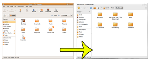
This simple update to nautilus will turn the defualt nautilus interface from a rectangle of wasted space and needless icons to a beautiful, simplified and easier to use style.
Ubuntu is currently addressing, fixing and sorting out ‘100 Papercuts’. These ‘papercuts’ are bugs, glitches or bad design that impact on the user experience in a big way.
One example that really shows off the meaning of ‘paper cut’ concerns Ubuntu’s default file browser ‘Nautilus’.
Bug #386150 "Nautilus file browser toolbar is complicated, redundant, and ugly".
When a user first opens nautilus, this is the swamp of information, buttons and space-hog they’re greeted with: –
To further exemplify the amount of space being used by, frankly, nothing take a look at this simple diagram by Andreas Nilsson. It shows the ‘Chrome’ (i.e. the ‘showy off’ bits) in relation to the amount of space actually given to presenting files to the user (the job of nautilus)
Thankfully, a rather awesome dude called Marcus Carlson has come to the rescue and has written a patch for nautilus that cuts away the cruft, eliminates the excess and is so awesome it cause me to type lame alliterative expressions!
In this ‘simplified Nautilus’ many features, tabs, buttons and information have been removed.
The Stop and Reload buttons have been combined, labels and the location toolbar have been turned off, the location bar was moved to the navigation pane, the location bar toggle was removed (use Control-L to access it), separators were removed, the up arrow was removed, and the computer icon was removed.
You can install this ‘patch’ in Jaunty by adding this PPA to your Software Sources, adding the gpg key and then just simply running an update.


