

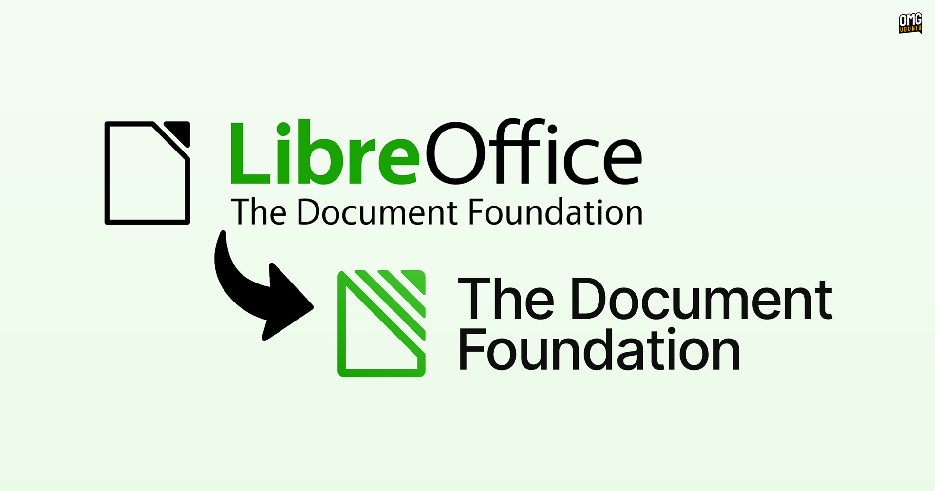
The Document Foundation, the non-profit steering the development of LibreOffice, has unveiled a new logo.
The change means that, for the first time since its inception in 2010, TDF no longer shares the same logotype and wordmark as LibreOffice.
“The Document Foundation” is now the sole wordmark, written in a different font, Inter, and a refreshed set of brand colours complement it.
Unveiling the design, TDF’s Italo Vignoli made the case for a decoupling of the two brands, noting “the foundation speaks as an institution, not as a software project” whose work “extends well beyond the product” that it’s known for, i.e. LibreOffice.

URA Design, a Berlin-based design agency whose former clients include Mozilla and the Tor Project, handled the redesign. Its founder also worked on Ubuntu’s desktop installer in the past.
Carving out a visual identity of its own feels somewhat overdue.
Besides LibreOffice, TDF also contributes to the Open Document Format (ODF) standard and advocates for document interoperability and digital sovereignty with public organisations, educational institutions and governments.
The change only affects the branding of foundation. LibreOffice’s branding, logo, etc are unchanged.
The new brand assets are available to download if you fancy having a nosey. TDF says it will begin to use its new logo, fonts and colour scheme across its official websites, social media accounts, documents etc in the coming months.