A couple of days back we mentioned that big ol’ design rejig is headed to Ubuntu Scopes.
More details about the ‘design evolution of Ubuntu Scopes’ was shared by the Canonical design and engineering teams at the Ubuntu Online Summit.
Why the need for a change? The usual mix of user-testing, developer feedback, design review.
Perhaps it’s best put by the Canonical Design Team themselves, who say: “A lot of people are in love with the idea of scopes [and] we have moved forward to the right presentation of them. The new design feels right.”
Hit play on the video below to catch up on the full hour-long session and see if the new design “feels right” to you.
Don’t have an hour to kill? No worries; you can skim on down to read a summary of the planned changes.
New Scopes Design: Planned Changes
Dash Browser
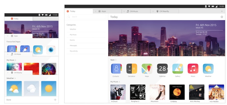
Ubuntu plans to improve to the overall look and feel of Scopes. A new “Dash browser” will frame Scopes inside a web browser UI (albeit one without a URL bar).
This proposed redesign, which the Canonical design team has been “signed off on”, effectively turns each Scope into a browser tab. You can open, close and manage Scopes just like regular browser tabs in the Ubuntu Browser.
It’s a UX metaphor that the design team say users feel more familiar with.
‘The big banner card can be set to any image you like’
Mapping the user experience of the Ubuntu web browser app to the Dash is a smart move. It cuts down on the complexity of learning to use the phone (once you know how the browser works you know how the Dash works, and vice versa) and it presents the concept of Scopes more cleanly (because they are, in many ways, mini search engines).
You can get rid of the ‘Today Scope’ in current builds of Ubuntu Touch by un-pinning it. That won’t be possible with these planned changes; the Today scope is the fixed default and cannot be closed.
But don’t panic if you don’t find it useful: the Today Scope is going to get better. The design team want to introduce greater customised and personalised content, be it a strip of your most used apps, music, local weather, or albums you’ve recently bought.
The big banner card you can see at the top will also be customisable, i.e. you’ll can replace it with any image you like. This is a compromise (of sorts) to introducing a fully customisable Dash wallpaper’ setting (a feature which the design team say is not on their roadmap).

A new ‘Scope Store’ will replace the current “manage dash” screen. This, the team say, is to enhance the discoverability of new and existing Scopes.
Rather like one of the pre-populated ‘new tab pages’ in Firefox, the Scope store will surface new ‘content experiences’ organically. The user no longer needs to head out to specifically find a Scope.
In summary, the main differences between the current Dash and the new, planned ‘Dash Browser’ are as follows:
- It looks like, and works similar to, the Ubuntu Browser app
- This is intentional; introduces an open and close scope tabs concept
- The old install > manage > pin method of using Scopes is going away
- ‘New tab’ functionality will improve discoverability of Scopes
- Bigger emphasis on personalization and customisation (e.g., banner, today scope)
- A new Scopes store to replace the “manage scopes” screen
- Moving between scopes is like switching tabs in the browser:
- Staged mode (phone) – uses bottom edge to open/navigate through a list of tabs
- Staged mode (tablet) & windowed mode – tab strip visible in the Dash browser
Improved Filters
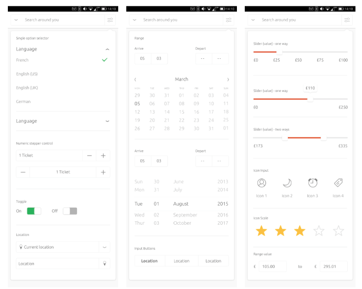
The design team also showed off new Filters and Filter widget. A handful of the planned changes, such as merging departments into the search box, adding ‘keyword bricks’, are in use in OTA-10, with further APIs set to land in OTA-11.
In summary:
- New set of ‘commonly used filters’
- Scopes authors can decide which filters to show
- New filter widgets include two-way sliders and a value input
- Filter widgets plus keyword bricks will help users narrow down results faster
Visual Refresh
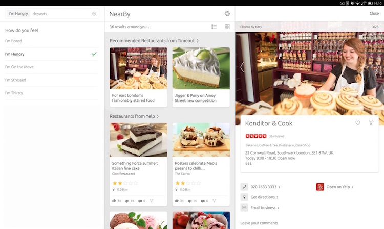
Expect to see all Scopes benefit from a visual refresh. The design team plan to improve the look and feel of all Scopes by introducing white background, consistent buttons, new shadows and lighting, and the a new colour palette.
A richer set of card previews — which show snippets of results that can the user can tap/clock on to view in more detail — will help users action items more quickly than in the current Scopes experience. For example, ‘instant actions’ will let users like a Facebook photo from the snippet preview, or tap on a ‘call’ button to trigger the phone app.
New panel layouts will be added to the UI toolkit to improve the usefulness of Scopes on tablet and desktop screens. The range of snippet elements and quick actions are also being increased.
Oh, and expect plenty of white.
Check Out The Full Presentation
For further detail on the ins-and-outs of the design do check out the full hour-long session in the video at the top of this post.
You can also grab the presentation slides used in the video by tickling the button below.
Remember: Thing Can Still Change
The new design presented in the mockups may have been “signed off” but do keep in mind that all features highlighted during the Q&A are subject to change, iteration and improvement before they’re moulded into malleable code.
And to pre-empty the answer to your question about when can you expect to see these stylish new Scopes on your device? There’s no firm date, but the design team do say expect it to be within the next 6 months.