


Is it time for Ubuntu to bin off one of its most visible icons?
Designers who work on the community-based Yaru icon theme are trash-talking the trash icon (in a constructive way, of course), proposing a replacement that looks (if I do say so myself) far from rubbish.
Icons aren’t the most important thing, and to many they’re almost an invisible concern: they’re to see, not swot over. Debates about consistency, motifs and metaphors, optical proportions or pixel-sharp rendering seem dull to some.
To others, good design matters – and a clear, coherent design matters most. It improves usability, reduces cognitive burden (“what is that icon for?!”) and, in a broader sense, conveys an operating system’s identity and tone.
Which is a wordy way of saying that no matter which side of the Venn diagram you’d put yourself in, there is an overlap.
Ubuntu’s trash icon is confused
Yaru is Ubuntu’s default icon set, and has been since 2018. In the years since its creation, many of its core icons have been reworked or redesigned.
Ahead of 25.10, the trash icon is the latest to undergo a design rethink.
The trash icon (or ‘wastebasket’ or ‘recycle bin’ or whatever else you know it as) is on the Ubuntu Dock by default, so it is a icon people see more than others.
But is there a need to change it?
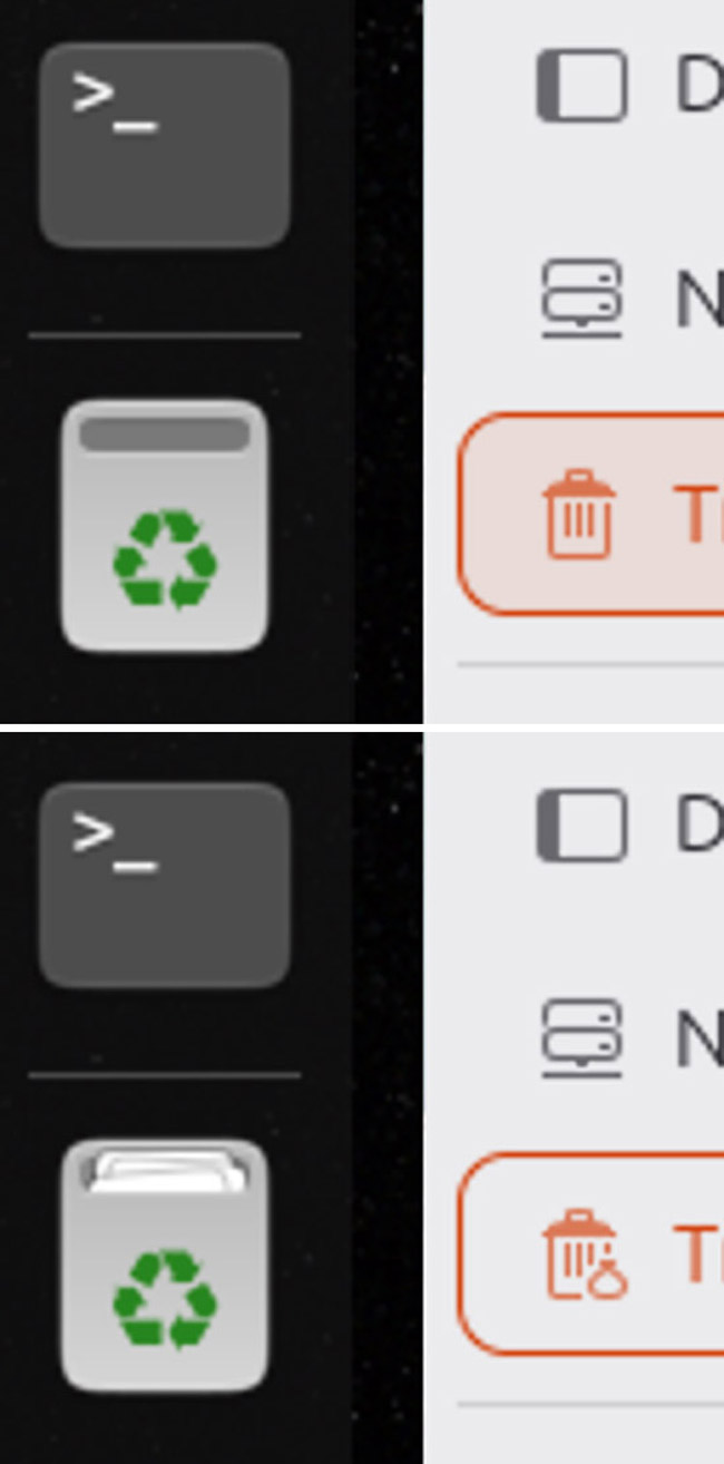
Well, it’s not fixed. It has changed a few times already, but with a glaring inconsistency: the full-colour icon shown on the dock doesn’t look much like a bin.
The current icon is a rectangle with a small ‘postbox’ style opening, inside of which there’s nothing (if trash is empty) or a stack of shuffled papers (if not empty).
Though it’s a well made icon and not indecipherable, some think it looks a little too…
Well, rubbish.
If you took the (universal) recycling logo off the front and showed the grey box with a slot opening to a stranger, could they tell it was meant to be somewhere to put junk files?
Some fear it looks more like postbox when empty, and a sleeve for holding documents when it’s full. You can judge for yourself in the screenshot …Somewhere about this page.
There’s another (albeit small) niggle: the big colour icon doesn’t match the simpler ‘symbolic’ version, which is what you see in the file manager sidebar. That uses a more literal trash can with a lid (and a bin bag of garbage when not empty).
No rule demands both icons must match – symbolics rarely stick religiously to their parent glyph – but the aesthetically particularly may benefit from a more thematically obvious association.
New trash icon is incoming
Designer ~ochi12 (the one who lent his talents to redesigning icons in the 25.04 cycle) has reopened a discussion on the Yaru GitHub with a view to improving the trash icon.
The Yaru team responded positively and, after passing a few ideas through the creative recycler, an icon that’s positively rubbish has emerged as the favourite:

The icon, above, was the result of several iterations. It’s more ‘tub’ like and has crumbled ‘contents’ (when files are in the trash). It uses a 3D perspective (a bit out of kilter with other Yaru icons, which tend to be head-on, but it’s not jarringly so).
Do you like it? Don’t get too attached. Nothing is finalised yet, and further discussions and design iterations are likely as the new icon is thrashed out (if not trashed out).
I’m hopeful that the Questing Quokka (and future releases) will indeed take a tidier-looking trash can on its travels. We’ll find out once Ubuntu 25.10 is released on 9 October 2025.