With Phosh, the mobile face of GNOME Shell, taking shape on phones it’s not a major leap to start thinking about how the GNOME user experience might function on larger screen sizes.
Like, say a tablet.
Despite some folks thinking that GNOME Shell was designed as a touch-focused UI, it wasn’t.
In fact, it can be pretty tedious to use without a keyboard or a mouse. Same was true of Unity, RIP.
To succeed in a finger-driven environment you need a finger-driven interface.
Just like the one on show in “very experimental” concept images recently shared by GNOME designer Tobias Bernard on the GNOME design Gitlab.
Tobias is lead UI/UX designer at Purism and works directly on Phosh.
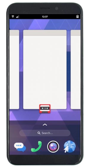
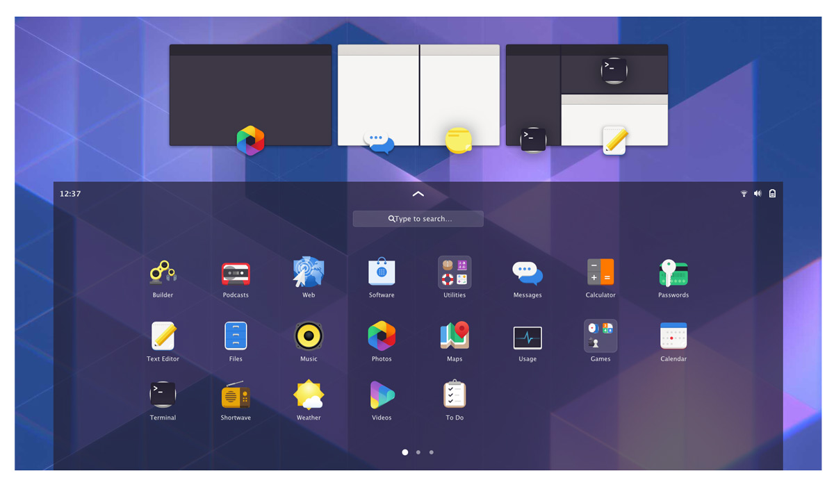
Converged GNOME Mobile Concept
All of Tobias’s interface mockups, which you can see more of below, are interesting. The UI resembles something of a marriage of the modern GNOME Shell we all know and its touch-orientated cousin Phosh:
It would’ve been easy to expand the hit area of Adwaita window controls, slap a dock on the screen and call it done (here’s looking at you, Unity 8) but that’s not what’s on show.
A good user experience is not merely an end sum made up from parts, but a sum of its parts.
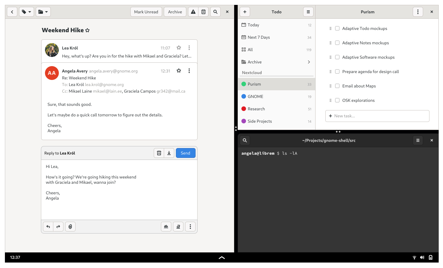
Take the notion of running three apps on the screen at the same time. It’s something we take for granted on the desktop, but on a tablet? Well, there it’s a bit more novel.
So it’s encouraging to see the designs factoring in why and how people use their devices (i.e. to get stuff done) and not simply focus on building a UI to make people use devices a specific way (didn’t go well, eh Microsoft?).
Take the calendar, clock, notifications, quick controls, etc.
Instead Tobias splits them out into an off-screen stage housing containing passive info (date, time, weather, etc):
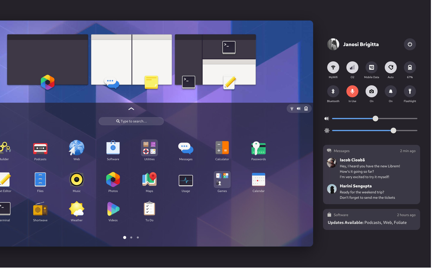
And an off-screen stag catering to actions (quick controls, notifications, etc):

I’ve no idea if this is a good approach — breaking news: I am not a designer — but it’s clearly a thought-out one. It’d be very easy to just ‘sweep’ all of this stuff under the bezel (so to speak).
All of these mockups represent a starting point and not a blueprint. Tobias’s concepts show one possible direction a GNOME-powered interface could take — and the emphasis is there: could take, not will take.
Bu with Pine64 gearing up to launch the first proper Linux tablet later this year, and the availability of convertible devices increasing, a touch-centric UI is an area Linux developers will need to tackle at some point.
And who better to signpost the way at this intersection of form factors than open source projects like GNOME?
h/t Alex & tipster