If you think the way GNOME Shell handles notifications and displays event information could be improved, you might be pleased to hear you are not alone.
The GNOME design team is exploring ways to improve the notification area
The GNOME design team explore a raft of ideas and refinements to the notification feature in mockups posted on the GNOME design Gitlab.
These potential revamps both reimagine and redefine what the GNOME notification experience could and should be — and personally, I think a rethink is sorely needed.
The GNOME Shell notification area (aka the ‘date and clock applet’ aka ‘message tray’ aka ‘calendar widget’) is a core part of the GNOME Shell desktop experience. It’s where notifications go when you miss them, where MPRIS controls surface, and where upcoming calendar events and alerts are listed
Right now the GNOME Shell notification/calendar area offers a frill-free experience. Functional, but not exceptional; providing only basic notification management options. Heck, it doesn’t even have offer a ‘do not disturb’ mode!
But that could be about to change.
GNOME Shell Notification Redesign
The GNOME design team explore a different approach to the notification and calendar area in their mockups, adding in much-needed organisation features (like notification grouping) and enhancing the “today” element with additional widgets.
King of the design proposals on the Git branch is the following “carded” design by Sam Hewitt (of Suru icons fame).
His approach isn’t radical (it’s still clearly the same notification area as today) but it makes changes that improve the overall “glanceability” factor:
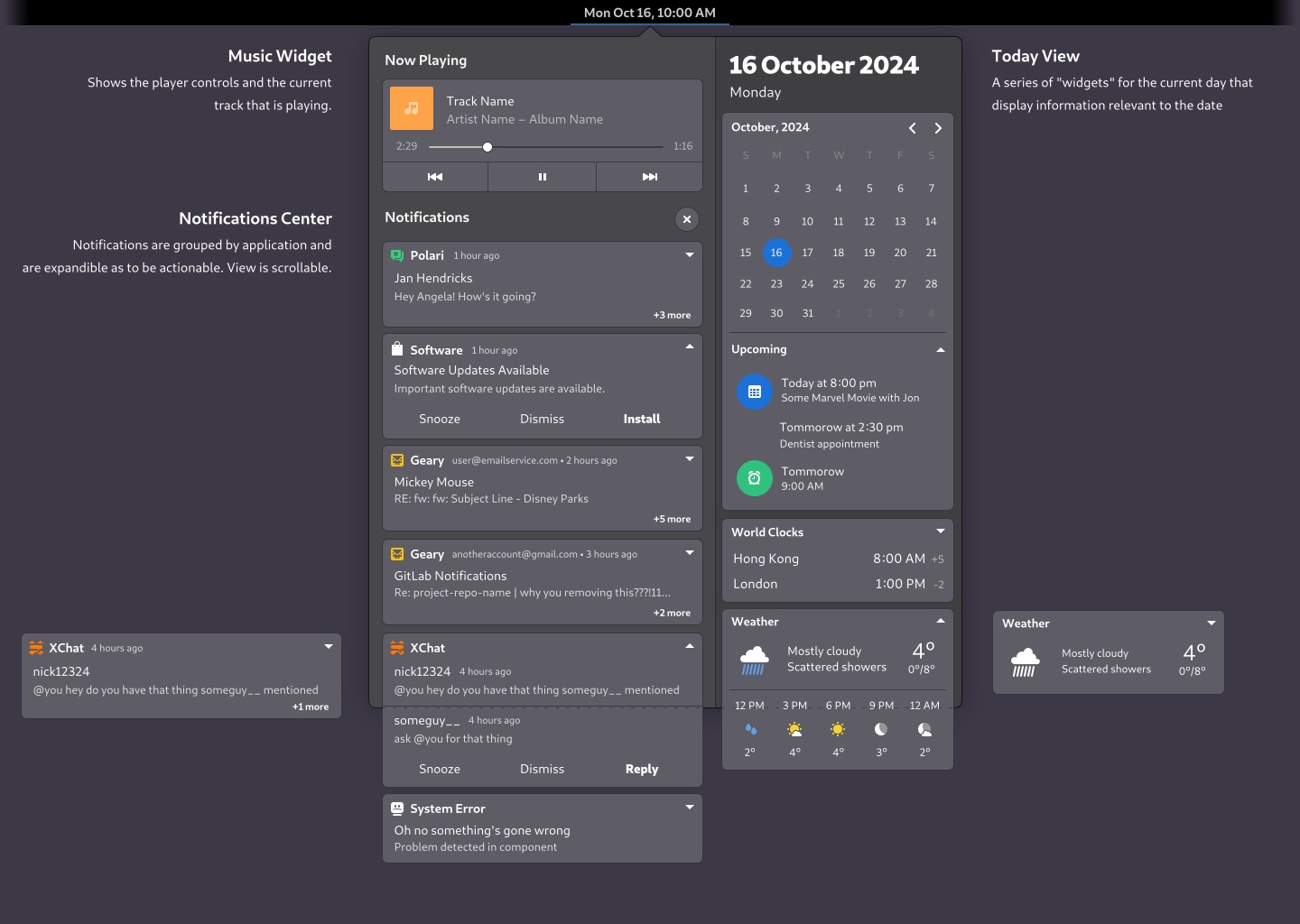
Or, to put it another way, his redesign makes your brain work less when you look at it. Everything is ordered, tidy, and well presented.
I dig the improved weather and world clock widgets too, while listing upcoming calendar events in a more parseable manner helps tie the calendar into the “transient information” loop.
But Wait, There’s More!
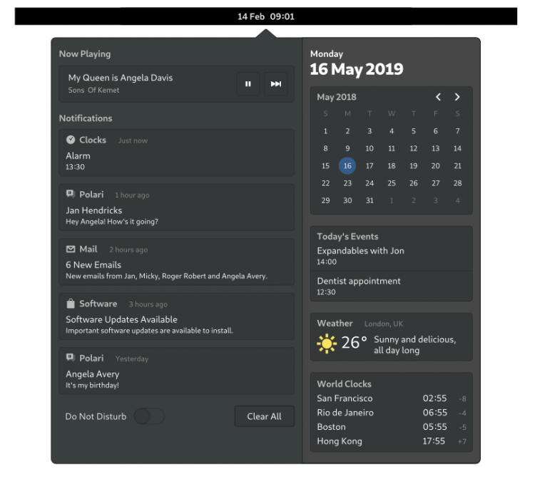
If the carded approach doesn’t catch your eye, the direction being taken by GNOME’s Allan Day might.
He explores similar, yet subtly different ideas with this mockups.
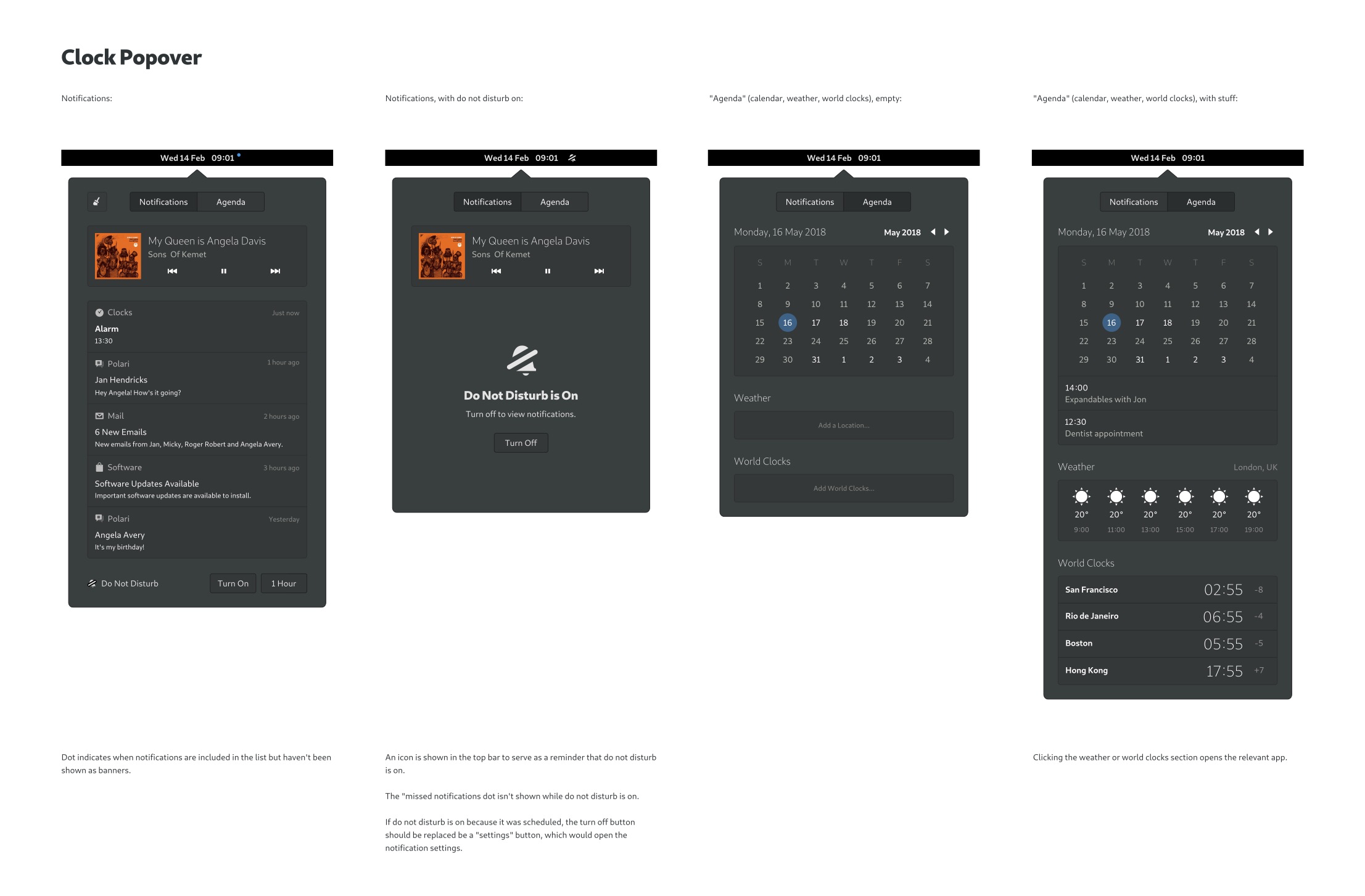
The first is conservative, making only “minimal changes” to the way the notification area currently behaves in GNOME Shell (but adding a ‘Do Not Disturb’ switch for good measure):
Not revolutionary enough?
Day’s second concept explores a set of “extensive changes”, including expandable notifications, and notification grouping (by app). It also introduces a configurable “agenda” section underneath the calendar:

While the two-column approach is consistent in the mockups above, an earlier concept explored the use of a single-column layout with tabbed notification/agenda pages:
When To Expect These Changes
I’ve made a point of peppering this post with caveats to remind you that what you see isn’t what you’re about to get.
There’s no (current) code attached to any of these mockups, and there’s no indication that any of the changes on show will be adopted at all, much less in time for GNOME 3.34 release in September.
I should also stressing that GNOME designers designing things is apropos of nothing; they’re always designing., e.g., those stylish login and lock screen designs from last year are yet to transition to reality.