
Ubuntu isn’t alone in exploring major theme changes of late, with GNOME 3.36 set to debut with its own visual improvements in tow.
As spotlighted by Alex (aka BabyWogue), the current development work on GNOME 3.36 introduces a brand new aesthetic in the calendar/message tray and in the GNOME Shell search overview.
Notifications listed in the GNOME Shell Calendar/Message tray have a more prominent appearance, made distinct and separate by the use of a drop shadows (rather than only a subtle border outline, as per current code).
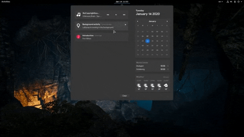
The “carded” look extends to other elements nestled in the drop down too, including the calendar, world clocks, and weather. A “light” effect is applied on mouse over in the standard GNOME Shell skin.
The (admittedly fuzzy) .gif above also demonstrates two additional tweaks I’m pretty pleased to see. First, new “hover” state for individual media control buttons, an effect that had been missing until now; and secondly, larger icons in notifications.
Another item in the “big obvious changes that you can’t help but notice” column affects the “search overview”. It now looks like this:

Search results (excluding matching apps) now appear pod-like boxes, grouped by source (which fans of the shell will know can be easily reordered since 3.34). It’s a pretty change but also a functional one: it’s easier to parse which results belong to which source, even when viewed against dark wallpapers.
A tonne of code refactoring has taken place in the shell ahead of the next release, and chances are there’s a fair bit more to come yet.
It’ll also boast another much requested feature: respecting your font settings.
Remember that GNOME 3.36 is under active development and none of the changes on show in this post are guaranteed to appear in the final release, due in March.