Linux Mint unveiled plans to refresh its famous logo with a ‘more modern’ design last year, but since then it’s been pretty quiet about how the effort is going.
So you may be interested to know that it’s finally shared an update on the status of the revamp.
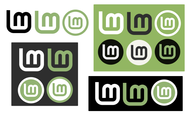
Work on the rejigged Linux Mint logo is continuing, and Mint say various “issues and margin inconsistencies” with the original logo have been addressed by the new design, the latest iterations of which you can see below:
“We’re going towards an LM shape which looks similar to the original, but without these issues, without the gap between the two letters and without the surrounding leaf,” explains Mint project lead Clement Lefebvre in his latest monthly update.
Ditching the leaf is arguably the most controversial element of the proposed revamp, with many users feeling that the shape is intrinsic to the look and feel of the Linux Mint brand.
But the lack of symmetry makes it difficult to repurpose and position the leaf-wrapped logo in other places, such as within the system UI, as well as within other shapes, in different colours and so on.
To the aim is to reduce the logo to just the “L” and “M” letters, albeit still connected.
Regardless of the glyph the distro ends up sporting it’s important to remember that the OS behind it remains the same. Linux Mint is, after all, more than a logo.

