The Fedora “Infinity” logo has been a staple part of the Linux landscape for as long as I’ve been using it — but that could be about to change.
Fedora plans to update its famous logo and word mark with a fresher, more modern version that’s easier for designers to work with.
To help decide, the distro is asking the wider Linux community for its feedback on “two different directions” they’ve come up with.
Both design proposals maintain brand recognition, but both also put a new, modern twist on an old, familiar classic.
Fedora Logo Redesign
The current Fedora logo is up there with Linux penguin (Tux), the SUSE chameleon, and the eminently recognisable Ubuntu circle of friends.
That’s that this degree of familiarity is unexpected: the ‘infinity’ logo and Fedora word mark has been much the same since 2005.
But longevity is not a sign of perfection.
Red Hat’s Mairin Duffy, a member of the Fedora design team, details the compelling technical impetus for implementing a brand update sooner rather than later.
Touching on a number of ‘technical reasons’, she’s clear that the overhaul isn’t being done “for change’s sake” alone but to improve Fedora, its brand communication, and its ecosystem of products and services.
Amongst issues with the incumbent logo:
- Difficult to center the ‘bubble’ in stacked designs
- Logo can’t be rendered in a single colour
- Logo colours don’t work well on dark backgrounds
- Often confused with Facebook logo
- Wordmark version is difficult to position
- Uses a closed source font
- The ‘a’ in Fedora looks like an ‘o’
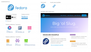
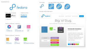
After several months of discussion, iteration, and exploration two design proposals have been put forward, both of which you can see embedded below.
Neither mockup strays far from the logo most of us are familiar with (this is intentional) with emphasis on the ‘f’ retained:
The first redesign proposal sticks fairly closely to the current design, even keeping the speech bubble, but irons out some of the aforementioned niggles.
The second proposal represents a more dramatic change. It uses a new-look ‘infinity’ icon (sans bubble) that is top loop heavy but with improved contrast on darker backgrounds.
Which do you prefer?
For the full ins and outs on the proposals, the history of the Fedora logo, and the reasons why an update is necessary, fling yourself on over to Mairin Duffy’s blog.
You can leave helpful, constructive and civil feedback on the proposals on Mairin’s blog as per her invitation or, if you’re feeling particularly brave, on the design bug ticket itself, linked below.


