![]()
GNOME developers are testing some bold improvements to the Adwaita GTK theme and the default GNOME icon set.
And in this post we take a sneak peek at their progress so far.
Now, if you’re a regular reader of this site then may recall our post on a new GNOME icon theme back in July. At the time only a handful of core GNOME apps had been given newly redesigned icons.
Fast forward a season or so and not only is the give-core-apps-new-icons initiative well underway, but the redesign effort has extended to other parts of the desktop experience, including the default theme.
Modernising the look and feel of GNOME apps and the shell is a) a bit overdue and b) happening as part of a wider update to GNOME design guidelines. The idea is to give the desktop a distinct yet consistent appearance.
Caveat
Before you go on please note that nothing you see in this post should be considered final, finished or complete. Some ideas are just that: ideas. Changes are being actively tested, explored, iterated on and are subject to change.
To be clear: everything in this post is a work-in-progress. That means you can like it, you can love it, and you can loathe it — but you can’t cry about it until it arrives in a stable repo somewhere, somewhen.
The Adwaita refresh looks like a mix of Adwaita and macOS, with a nod to iOS and Material Design
Adwaita Theme Refresh
Our good buddy BabyDora (aka Anime Alex, aka WOGUE, aka Ubuntu’s biggest fan) has been busy keeping his Twitter followers up to speed on all the latest changes to the Adwaita GTK theme as they’ve hit the respective GNOME nightly branches.
Nightly branches, for those wondering, are where bleeding-edge GNOME development takes place. Thanks to Flatpak, it’s relatively trivial for anyone to toy about with these bleeding-edge builds on a stable system like Ubuntu or Fedora without endangering their system! All you need are the right runtimes and repos configured.
The Adwaita refresh currently being tested looks like a mix of Adwaita as we know it (spacious, cold, functional) and material design, but with a nod to macOS (subtle gradients, rounded corners, bevelled buttons) and iOS (flat switches).

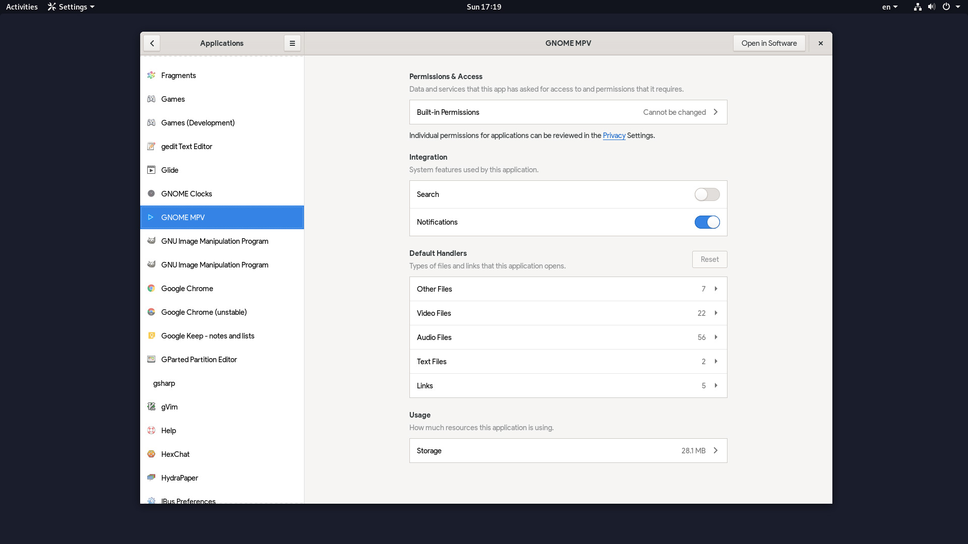
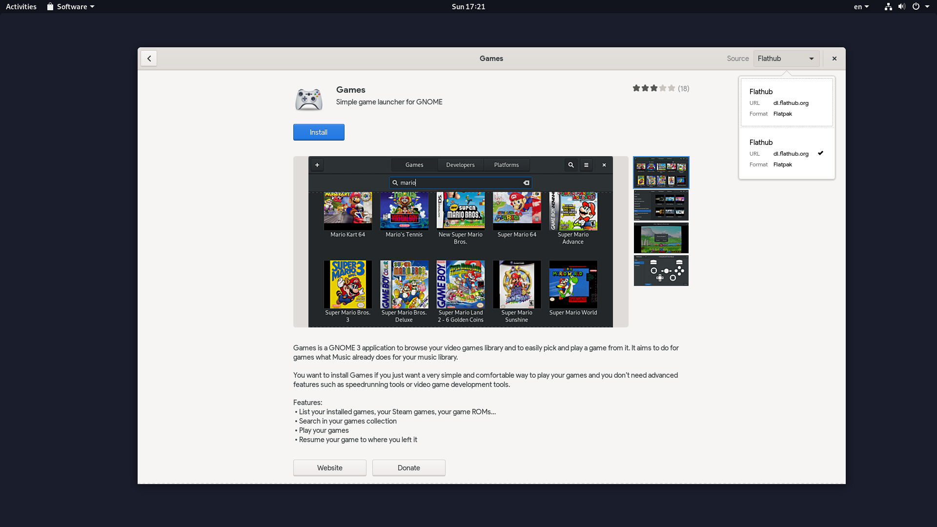
In the gallery above you can see how the Adwaita refresh looks in the latest nightly builds of three core GNOME apps: Builder, Settings and Software (spoiler: you may notice a few new features in the screens above too, like Flatpak app permissions and repo switching).
This “experiment” (as GNOME devs like to call their changes) is not revolutionary: Adwaita still looks a lot like Adwaita. Header bar buttons borrow the bevelled 3D perspective of the new GNOME icons (see below).
GNOME designer Allan Day created the mock up below. It appears to be the chief inspiration for the Adwaita changes already in master:

The mockup above presents a much broader refresh than that currently in code, with greater use of whitespace, accent colours, rounded corners, and font styling.
Fans of dark themes needn’t panic, either. The Adwaita refresh has a dark variant tracking the same changes:
You can see these and other changes up close for yourself in this Imgur gallery.
New GNOME Icons
![]()
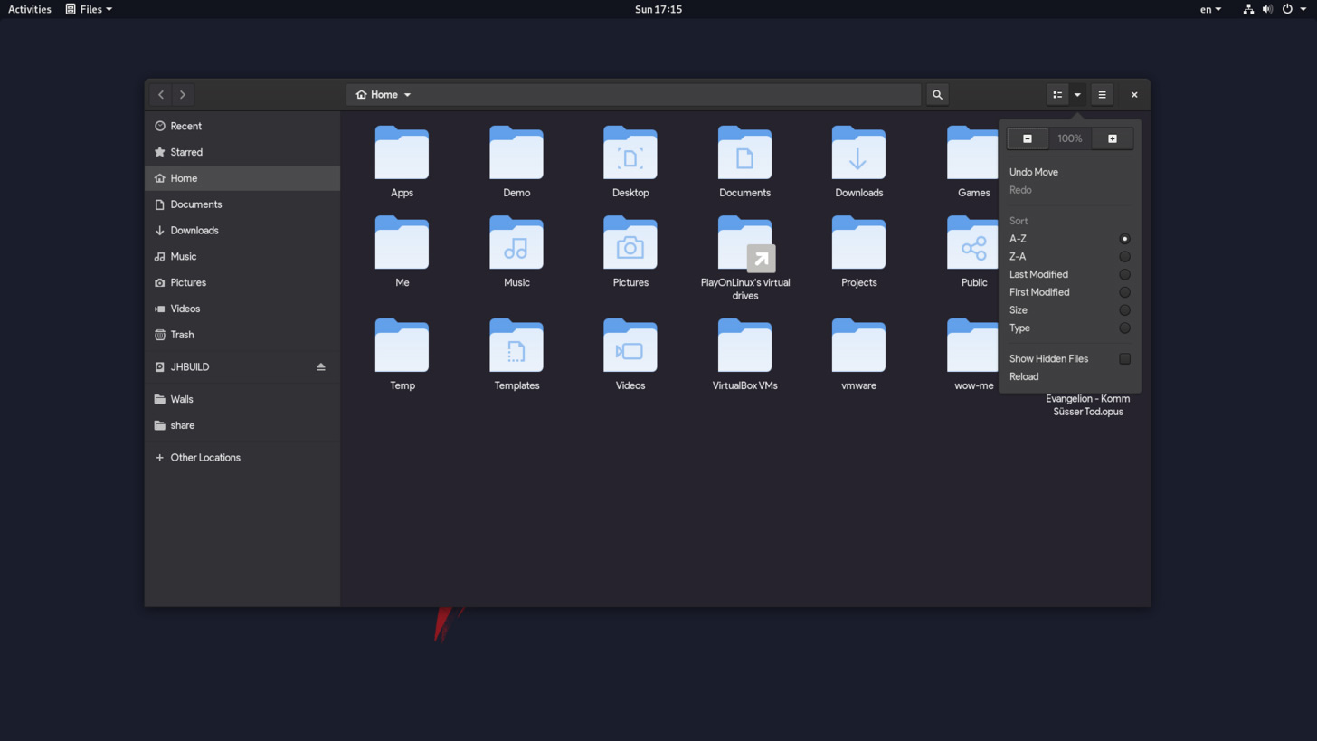
As well as a refresh to Adwaita GNOME designers are working on a revamped icons set. There are some major changes since we last showed you icons, including new folder icons for Nautilus (see above).
I like that the GNOME’s design team have put their own spin on the flat design trend du-jour. By making making use of perspective, gradients and shadows each icon has a tactile, physical feel to it.
The end result is an icon set that looks unlike anything else.
Personally, I’m hoping Ubuntu makes the new GNOME icon theme easily available. Suru is pleasant enough, but I find the lack of uniformity and overly simplistic glyphs create a fractured aesthetic.
Elsewhere
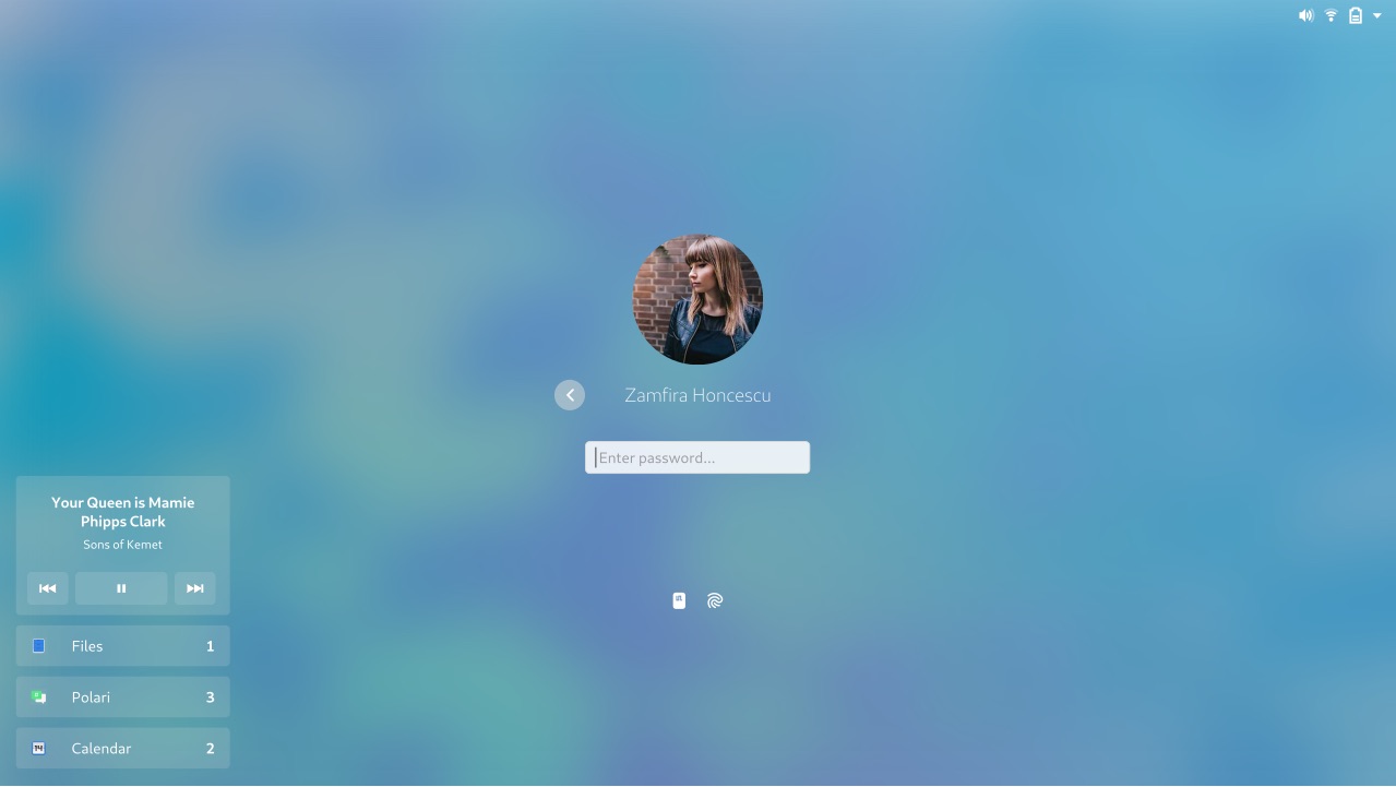
Adwaita theme and icons aside, GNOME designers are also hard at work improving other areas of the desktop shell, such as the login screen (latest design above), improving header bar layouts, implementing Flatpak app permissions in to Settings, and a whole heap more.
When can I use this?!
As mentioned, there’s no firm release date for any of this work as much of it remains a work in progress. If you’re familiar with Flatpak you can set-up the nightly repos by following these steps. Otherwise you’ll get to sample this as and when it’s ready!
A taster for what’s to come — these changes have got me feeling hungry for more!