 To do well, the upcoming Linux-powered Librem 5 smartphone will need a decent set of mobile-ready apps — and a good web browser is key to that.
Hoping to step up to the plate is GNOME Web (aka Epiphany), whose developers are working hard to make sure that the webkit-based browser is in fine form for finger-friendly fun while surfing.
In a blog post recapping work taking place to do just that, GNOME developer Adrian Plazas details on an important change he recently made to Web:
“[I made] Web have two modes that I named normal and narrow. The normal mode is Web as you know it, while the narrow mode moves all buttons from the header bar but the hamburger menu to a new action bar at the bottom, letting the windows reach yet unreachable widths.”
Plazas shares a short video which shows his WIP GNOME Web adapting to wide and narrow screens automatically on a Surface Pro tablet (the video wasn’t shared in an embeddable fork,
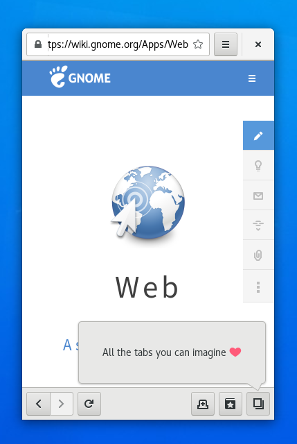
Web’s mobile features are a work in progress
Obviously all of this work is still up in the air, in development, and subject to change (though some code is already available to play with). As such everything you see presented here is not the final product – so don’t panic if you’re not impressed!
Plazas even hints that we may see GNOME Web’s ‘narrow mode’ mobile view…
- show a popover listing available pages instead of tabs;
- shrink the search bar instead of limiting its width;
- move away from the application menu model entirely
Although the latter of the ste[s sounds drastic it could, potentially, lead to some interesting interactivity and interface models.
Talking of the Librem 5, this week also saw developers share a sneak peek at the “Phosh” UI for GNOME Shell:

If you backed the Librem 5 handset last year you’ve permission to get excited!