
GNOME devs are working on an improved GNOME Shell login and lock screen — and it’s looking great!
Sharing images of the proposed new lock, unlock and login screen designs on his blog is GNOME’s Allan Day, who says the redesigns are the fruits of a week-long design hackfest GNOME held in London last year.
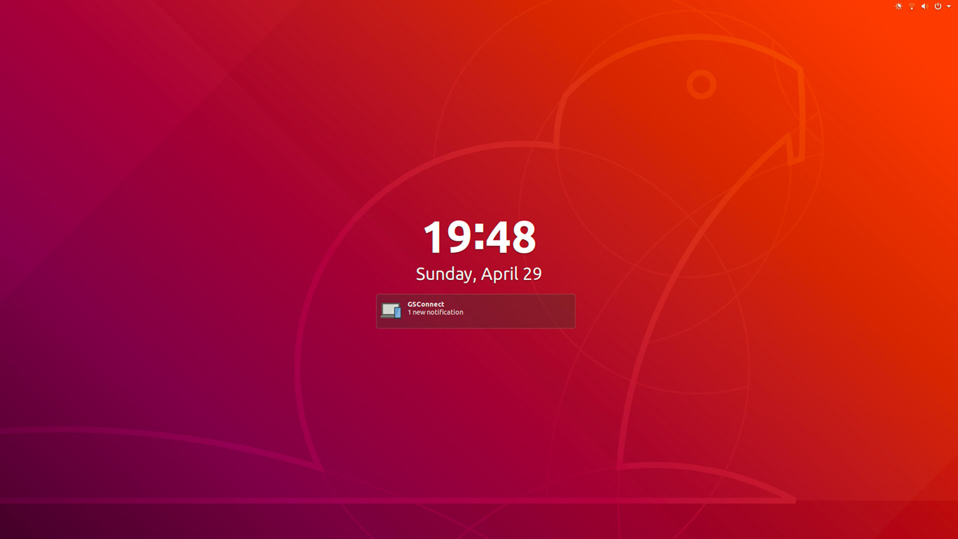
To help the rest of this post make a little more sense here’s a recap of what the existing “lock screen” looks like in GNOME 3.28 on Ubuntu 18.04:
And here’s what the “unlock screen”, which appears when you mouse up or press a key, looks like:
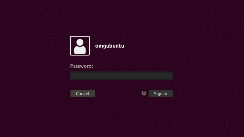
I’ve mentioned before that I’m a fan of the GNOME lock screen. I really dig being able to control music playback and glimpse my notifications without having to unlock my computer.
I do, however, dislike that notifications and player controls vanish from view when I go to unlock, I also don’t like the fact that neither screen makes use of my (always very pretty) desktop wallpaper as LightDM & the Unity Greeter did.
Thankfully these issues, and a few others, are being addressed by this revamp.
GNOME Shell’s Redesigned Lock, Unlock & Login Screens
You may be asking why GNOME is redesigning its various user screens. Well, GNOME’s Allan Day says it’s to address four key points:
First, GNOME want to “…[make] the lock screen frictionless, so that people can get to their session easily.”
Secondly, they want to add a little splash of “joy and delight” to the login experience. A bit of motion and movement through transition animations will achieve this.
Thirdly, they feel the overall navigation between screens needs to be improved. With the new design they want to introduce a ‘clear spatial model’ that allows users to under where they are in the flow and what they will want/should do next.
Fourth, and finally, the redesigns will to improve the experience for single user machines and multi-user machines through responsive design and smarter defaults.
New User Selection Screen

On single user machines GNOME plan to boot straight to the password prompt (which you’ll see in a second), meaning you won’t need to click your account “pod” first.
Lock screen
The new lock screen “shield” looks a lot like the current version, albeit with a blurred background image with simplified notifications, player controls, and other on-screen information:
User Login/Unlock Screen
When you “mouse up” (or hit a key) the lock screen “shield” transitions to reveal the password entry screen:
Unlike at present app notifications and player controls do not vanish when you get to this page but remain on screen, in view, totally accessible.
The password field screen also uses the same background as the lock screen shield, which is something I’m please about!
It seems that the backgrounds of the proposed new lock, unlock and the user login screens use the desktop wallpaper with a heavy blur applied. I think this adds a touch of personality — i.e. “yay, that’s my desktop!” — but also helps each page in the stack feel more connected
The (rather spiffy) video below shows the motion design for the lock/unlock screens in action:
GNOME’s new lock screens are still a work in progress
All in all these mockups look promising, don’t they?
But it’s important to remember that they are just that: mockups, not real code. Allan Day stresses that the designs he presents aren’t final, and that he expects them to “continue to evolve” based on feedback and user testing.
Hopefully these changes make it in to the release of GNOME 3.30 in the autumn.
So that’s what GNOME devs want to do with the GNOME Shell lock screens, but do these ideas match your needs? Share your thoughts in the comments section below.