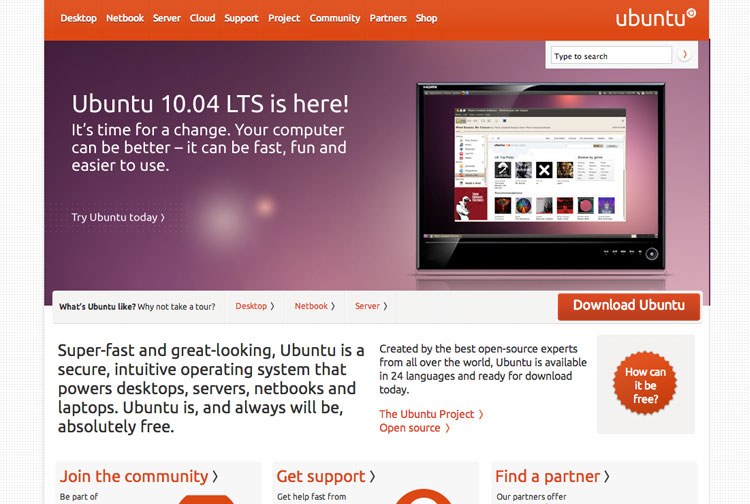
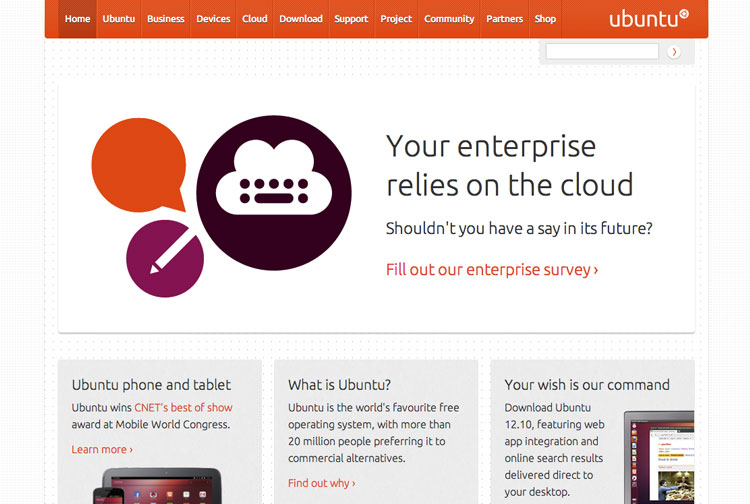
Some minor changes have gone live over on the official Ubuntu website from Canonical.
The most notable change at first glance include a revamped site header that now stretches the width of the screen.

Elsewhere:
- Text drop shadows have been removed from header items
- Dotted backgrounds replaced with a solid colour
- Search box integrated into the main bar
- Ubuntu logo now left-aligned
- Section Links streamlined
- Breadcrumb navigation replacing ‘sub-menus’
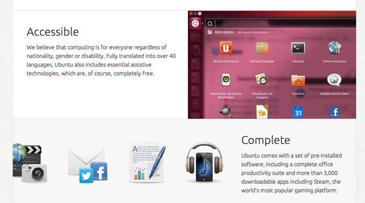
- Greater use of images in ‘About Ubuntu’ sections
Click below for a look at the Ubuntu website from the past.