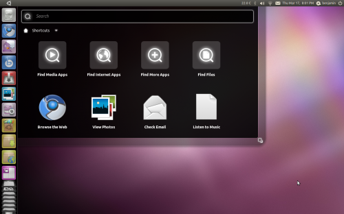
Unity is Ubuntu’s innovative new user interface, designed to catapult Ubuntu into the revolution of contextual search, launchers and social integration. The unique design provides an enticing alternative to the likes of Microsoft Windows and Apple’s Mac OS X.
But could Unity be better?
One problem when designing user interfaces is maintaining a concise control of UI complexity. As the designers themselves work on the design, they become accustomed to their work and lose sight of how the interface fares when it’s seen by fresh eyes for the first time.
This problem is magnified by the fact designers are surrounded by developers and enthusiasts who easily handle the complexity and generally don’t kick up a fuss. The first time user interfaces are seen by those outside “the inner circle” – during user testing – it’s often too late for changes to be made or usability issues that crop up to be fixed.
User interface complexity doesn’t just decrease learnability but it also decreases enjoyability. To enjoy something completely, we must be able to focus 100% on what we want to enjoy – usually the task at hand. I’m sure we’ve all tried to watch our favourite movie, only to have that person continue talking when we really want them to be quiet. When the UI obstructs or irritates, enjoyabilty goes down.
While learnability can be overcome as time passes and the user becomes familiar with the system, if the UI is badly designed and cannot easily be changed, enjoyability cannot be improved as long as the UI continues being that person.
An example of a device that possesses both low learnability and high enjoyability is Apple’s iPad. The user interface is simple, consistent and there are little unexpected behaviours. The learning curve is small, hence why it has had excellent success with the mainstream, and it’s a joy to use with a very task-centered UI.
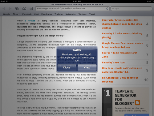
But the iPad isn’t without its faults. The notification system is one such example of the UI that constantly irritates me by popping up a dialog and rudely interrupting my work, and this is an example of very poor design. Android’s system is much better: it notifies but does not intrude.
While I can’t improve Apple’s notification system, as an open source community we should be able to improve the UI in our open source products.
So what’s wrong with Unity?
Unity has a very large surface area. With much of the development done only in the short 6 month development cycle for Natty, including the original Mutter work for the netbook edition being rewritten entirely for Compiz, the interface has become cluttered and inconsistent.
The term surface area in user interface design is basically a measure of how complicated the interface is. An interface with more dials, buttons, and objects has a greater surface area. For a deeper explanation, see the Surface Area paragraph in this article.
Rather than one central location for access to everything (like Windows’ Start Menu), Unity spreads access to your computer across a complicated Dash with a few different modes: the ‘Ubuntu Button’ dash, the Applications dash, and the Places dash. The latter two barely visible and squashed to the bottom of the screen in a badly executed, icon-distorting concertina effect.
In the rush to get Unity ready for Natty, many important design details are being missed. Some examples:
- How does one use Unity in a right-to-left language?
- Where is the differentiation between apps and preferences?
- How does one find out what version of Ubuntu they’re using?
- What has user preferences got to do with logging out/shutting down?
A lot of the behaviours for the launcher are completely counter-intuitive. For example, when the launcher is hidden and an application requests attention, it pops out briefly and then slides back to the left. Naturally, one would move their cursor to the space where it last disappeared, but it does not reappear. Much like a search and rescue man hunt, the rescuers begin searching from a “last known position.” So do people using a computer.
Another counter-intuitive behaviour characteristic of Unity’s Launcher is how you rearrange items. Rather than simply dragging the item from A to B, you must first drag it right off the dock and then back on.
Also, the items apparently are not equal – some can be moved anywhere but not below the last application shortcut, some (like Places) cannot be moved anywhere above the last application shortcut, and the Trash icon cannot be moved at all.
For consistency’s sake, if some icons move, all of them should, or all of them shouldn’t. Otherwise, there should be a clear indicator as to why the ones that cannot move, can’t. Currently, this indicator is that they’re “gray.” Perhaps a divider would work better?
Recently, the hot topic has been Canonical designer Matthew Paul Thomas’ email to the Ayatana mailing list questioning the invisible application menus in the panel.
Contrary to popular opinion, applications aren’t actually moving away from menus – at least not yet. The Elementary Project, Google Chrome and Firefox have made inroads with their menus, hiding them away in a collapsible button. But the majority of applications currently shipping with Ubuntu still rely on a menu of some shape and form, and hiding it from the user to encourage application developers to build menu-less apps isn’t a solution to the problem and strips users of easy access to a number of application features.
If the menu was hidden but there were some visual cues to the fact it was hidden, then at least a few people would recognize its existence. But currently the only way a user will discover these hidden menus is simply by accidentally mousing over the area where they are hidden, or by asking a friend. A completely non-elegant solution to a non-existent problem.
If Ubuntu is still targeting the Windows market share, Windows converts will initially look for extra application functions in a menu located at the top of the window. Failing that, they will attempt to find it somewhere else within the application window because naturally one expects application menus to be related to the application itself. The last place they will look is hidden behind the application name in the top panel, which if you’re on a large monitor, is far away.
What is actually more concerning about the email MPT sent to the Ayatana mailing list is the seemingly unbelievable lack of communication the design team has, especially considering MPT originally designed the menu specification. Are they even talking to each other?
Design decisions for Unity are seldom made in public, and they’re only announced after due effort, time and money have gone into implementing them. When there is a backlash, decisions are rarely overturned.
Mark decided on the window button order for Ubuntu 10.04, overruling the design team to make room for “windicators” (which of course, is another story entirely).
Later, user testing revealed that the order Mark had decided on made Chinese users think that Ubuntu doesn’t understand Chinese culture, but the order remains today.
How can we fix Unity?
But let me stress: Unity is not all bad.
While a number of the concepts in Unity may be flawed from a design point of view, the actual idea itself is not, and Canonical deserve applause for trying to jump start the stagnant open source desktop with Unity when the alternatives do not evoke confidence.
But there are some solutions to make Unity more unified:
- Work on making Unity simpler, compact and more intuitive
- Publish major design changes early and often for public review
- More user testing and community feedback from the start.
Even if Ubuntu’s design was perfect, competing with Microsoft, Apple and now Google is a monster challenge that cannot be taken lightly. If Canonical is serious about doing so, they really need to spend more time thinking through the design of their flagship product.
There is still time to fix a lot of the issues I’ve outlined in this article. Not all, but some.
I think fixing the few minor issues that seem to be offending the most would go a long way in making Ubuntu’s Unity interface rock in Natty.


