
Major improvements to Ubuntu’s default ‘Yaru’ theme are coming in Ubuntu 20.04 LTS.
The community team who work on the Yaru GTK theme recently spent a week at Canonical’s London HQ for an in-person ‘design fest’. There, alongside members of the official Ubuntu design team, they worked on improving the look, fit and feel of of Ubuntu’s default appearance.
Bugs and and ‘paper cuts’ in the current version of the theme were ironed out, and a crop of major colour changes were agreed upon — changes that alter the overall ‘look’ of the Yaru theme quite considerably.
Enter the colour purple.
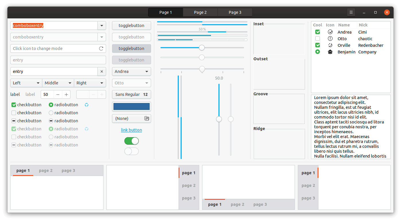
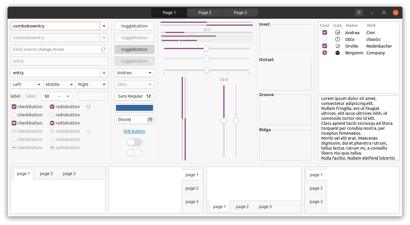
Yes, instead of being (various shade of) blue and green (as they are currently, on show in the gif above) upstream development on the Yaru theme makes active/selected checkboxes and radio buttons, as well as sliders and progress bars purple instead.
I know: major change, right? 😆
Okay, so everyone’s definition of ‘major’ will vary, but for me the decision to swap the key colour accent used throughout the theme — “the look of Ubuntu” if you will — counts as major. It’s kinda the most identifiable part, right?
The “purple” use in sliders and check boxes and toggle is far more pronounced when seen in situ, as this screenshot of it in the ‘dark’ variant shows:

But why swap colour at all?
Well, Ubuntu cite the important of branding and say “…[switching from green to purple will] reduce the abundance of colours used overall, while still making it unmistakably Ubuntu.”
Other Yaru Theme Changes
Beyond colour changes there are also less obvious changes like contrast improvements, such as more pronounced button borders, selection box outlines, and so on.
Interestingly (well, interesting to folks who like design I guess) is that the Yaru theme rebases much of its colour choices on the open source Vanilla framework developed and maintained by Canonical’s design team.
This is sensible; these are the same greens, yellows and blues that help tie together disparate interfaces and front-ends throughout the Ubuntu software stack, desktop and beyond. I’m a big fan of consistency and continuity.
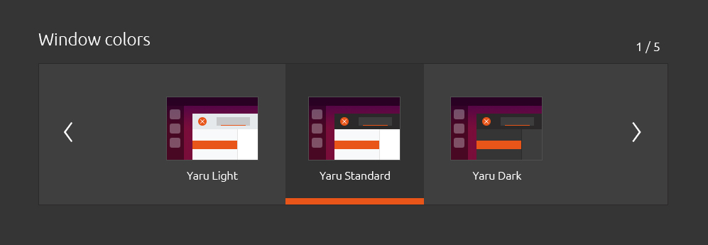
There’s also been more work on the full-dark and full-light variants of Yaru.
Further to my recent rant about not being able to easily switch to a dark theme, Ubuntu says is plans to “reintroduce the ability to switch between [theme] variations” through the Settings app — nice!
Gr-azy New Folder Experiment
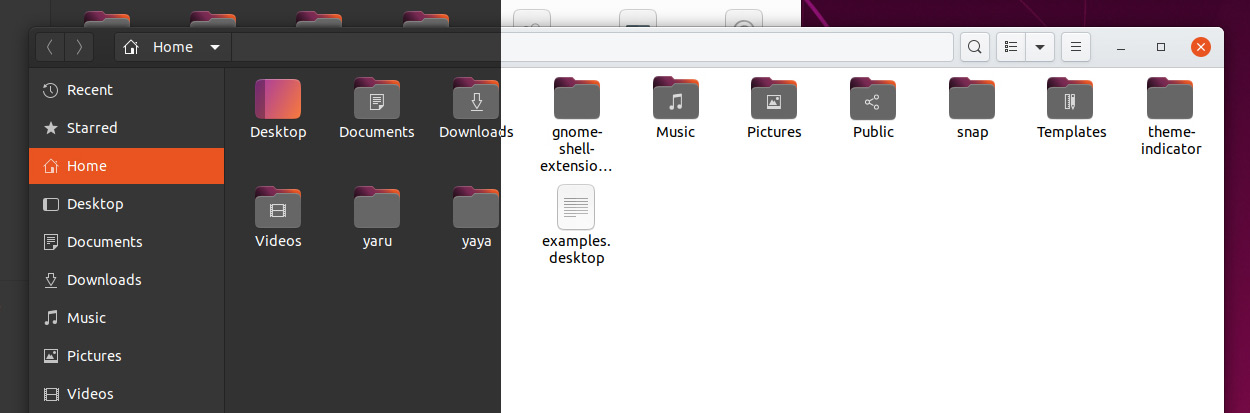
There are also a few experimental — i.e. not set in stone — ideas for folder icons, one of which you can see below:
I can’t tell if the dark clay look works or not. It’s a colour that doesn’t feel like it echoes an element in the rest of the theme (not in the regular version; it works better in the ‘dark’ variant).
I do dig the gradient effect used on the “inside”. It’s perhaps a bit too dark, but is a nice nod to Ubuntu’s colour scheme as a whole. So good we use something similar in our site header!
Don’t get too upset/attached to the folder icon experiment above as it simply that: am experiment. You can view a couple of other ‘explorations’ for the look of folder icons in the gallery below (again, these might not happen):


When can we expect these changes?
The hope is that the bulk of the changes on show here will make it in Ubuntu 20.04, due in April.
It is possible that the more substantive changes — like the experimental folder icons — could be held over until Ubuntu 20.10, which is due in October.
Summary
Ubuntu’s default theme is being improved with introduction of a colour palette that’s more consistent with the rest of Ubuntu’s design work — and heavy dose of purple.
You’ll be able read more about the changes (and some of the thinking behind them) over on the Ubuntu blog/discourse in the coming days.