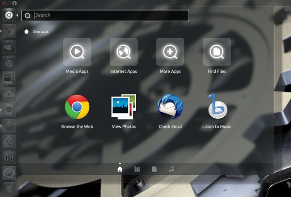
Not a fan of the 8 giant shortcuts in the Unity Dash? Ubuntu 12.04 might just present you with something different…
Ubuntu developers are testing a new layout for the Unity ‘Home Lens’.
In place of the iconographic links the Ubuntu 12.04 Dash may display an overview of recent user activity under the headings “Recent Apps” (which won’t feature those apps locked to the Launcher), “Recent Files”, and ‘Downloads’.

Why The Change?
Ask yourself how often you use the shortcuts on the Dash to open applications or browse file. If your answer is ‘rarely’ then congratulations: welcome to the majority.
The tiled home screen isn’t a bad idea. It’s a good one. But on a desktop home to the similarly purposed but more featured and configurable Unity Launcher it feels superfluous and confusing in aim – something that User testing appears to bear out, as John Lea of the Unity Design Team writes:
“[The tiled screen is] ..a cause of confusion and difficulty, as they launch programs but lack the other features inherent to the other icons that are present in the dash.”
One-size-fits-all solutions are, by their very nature, too restrictive for some, too open for others, and ‘just right’ for a few. The Unity’s proposed ‘Home Lens’ is a comfortable move towards the Dash tailoring itself to users needs.
But how about adding some additional elasticity? Let users decide what information is shown in the overlay and in what order. For example, I have more need to see see recent tweets from the Gwibber Lens than my most recently used applications.
I can’t help but feel that such a feature would really begin to highlight the ‘U’ in Unity.