Earlier this week Ubuntu’s Community Super-dude Jono Bacon blogged his delight at the ongoing-progress of Ubuntu 10.10’s spiffy new Sound Menu. We, too, here at OMG! towers, have been going a bit gaga over its development lately.
There is one aspect that seems to split readers down the middle whenever we share a screenshot of it: do the control buttons look right or not? Largely it’s irrelevant because – lest anyone get’s aerated and cause a panic – the application is still very much a WIP. (Work in progress). That doesn’t placate the mind however!
Sean W mocked-up his ideal Sound Menu look and popped it our way. He explains the design: – “ [the mock-up is] Consistent with a monochome look. Artist, track and album should have it’s own line for the full space of the applet, so longer names can be better seen. Cover and player buttons can be together, since they don’t get resized.”
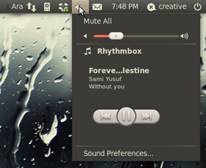
For comparison here’s how the indicator is looking right now (it does display album art too but the track being played didn’t have any) : – 
Which do you prefer? Got a better design in mind? Sound off, share mockups and play nice in the comment space below…
