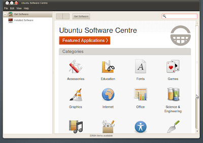
The Ubuntu Software Centre in Ubuntu 10.04 got a new look store front today, trading its old colourful drapes for elegant whites and greys.
Note: Clicking on the pictures below will take you a full-sized version.
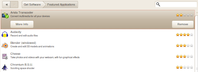
The ‘Featured’ button is now very prominently displayed – great news for the 19 applications selected within.
The application view has also been re-jigged and brightened up with the screenshots now featuring more prominently at the bottom of the application blurb rather than to the right hand side.
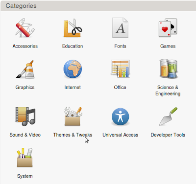
My unobservant eye also spots a new ‘Themes and Tweaks’ category for the first time.
Despite all of the current “stock” in the software store being free the installation label still takes heed to mention this specifically: –
Perhaps a hint at the future non-free software to be made available via it coming a little sooner thane expected? Or just a small reassurance to new users that this is still software-libre? Time will tell…
Conclusion
The new look store not only looks professional it screams it. Whilst there are still issues to be addressed with the current layout of the store (for example: is the side-pane really needed?) the applications handles much more intuitively than version before – thanks in part to the addition of two navigation buttons.
The decision to enlarge and reposition the application screenshots in application view is bang on; seeing as well as reading about an application can really help you decide whether or not it’s worth your bandwidth downloading.


